
Complete CSS Flexbox Guide for Beginners in 2026
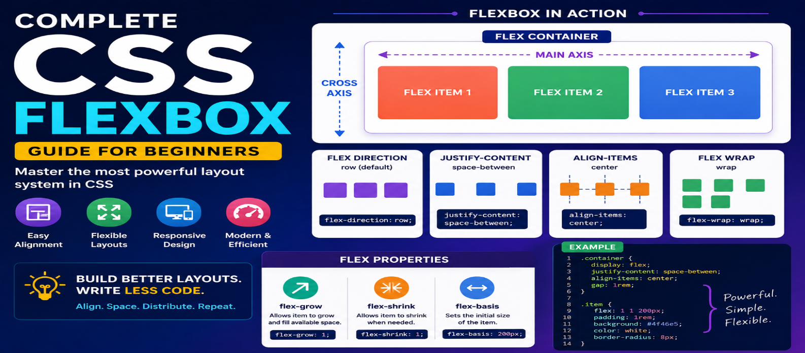
"Learn CSS Flexbox from scratch with practical examples covering flex containers, alignment, spacing, wrapping, responsive layouts, flex properties, and Flexbox vs Grid."
Complete CSS Flexbox Guide for Beginners in 2026
Building layouts used to be one of the most frustrating parts of CSS. Developers relied on floats, positioning tricks, and complicated workarounds simply to align elements or center content.
CSS Flexbox changed that.
Flexbox provides a straightforward way to arrange elements in a row or column, control spacing, align content, distribute available space, and create flexible layouts that adapt to different screen sizes.
If you're learning CSS in 2026, Flexbox remains one of the most important layout systems to understand. This guide takes you from the basic concepts to practical layouts you can start building immediately.
What Is CSS Flexbox?
Flexbox stands for Flexible Box Layout. It is a CSS layout model designed primarily for arranging items along one dimension at a time.
That dimension can be:
Horizontal → Row
or
Vertical → Column
Consider three cards inside a container:
<div class="container">
  <div class="card">HTML</div>
  <div class="card">CSS</div>
  <div class="card">JavaScript</div>
</div>
Turn the parent into a flex container:
.container {
  display: flex;
}
The three cards now participate in a Flexbox layout.
That single declaration gives you access to powerful alignment, spacing, sizing, wrapping, and ordering controls.
Flex Container vs Flex Items
Understanding these two terms makes Flexbox much easier.
When you write:
.container {
  display: flex;
}
.container becomes the flex container.
Its direct children become flex items.
So:
Flex Container
├── Flex Item
├── Flex Item
└── Flex Item
Most Flexbox properties are applied either to the parent container or individual flex items.
Understanding the Main Axis and Cross Axis
Flexbox works around two axes:
Main Axis — the direction flex items flow.
Cross Axis — perpendicular to the main axis.
With the default:
flex-direction: row;the main axis runs horizontally.
Change it to:
flex-direction: column;and the main axis becomes vertical.
This distinction is important because Flexbox alignment properties operate relative to these axes.
flex-direction: Choose the Layout Direction
The flex-direction property determines how items are arranged.
.container {
  display: flex;
  flex-direction: row;
}
Common values include:
row
row-reverse
column
column-reverse
For a horizontal navigation menu, row is usually appropriate.
For vertically stacked controls, column may make more sense.
justify-content: Control Main-Axis Alignment
justify-content controls how flex items are positioned along the main axis.
.container {
  display: flex;
  justify-content: center;
}
Useful values include:
flex-start
flex-end
center
space-between
space-around
space-evenly
For example:
.navbar {
  display: flex;
  justify-content: space-between;
}
This can place a logo on one side and navigation controls on the other.
align-items: Control Cross-Axis Alignment
align-items controls alignment along the cross axis.
A common navigation pattern is:
.navbar {
  display: flex;
  justify-content: space-between;
  align-items: center;
}
This distributes items horizontally while vertically aligning them within the navigation bar.
Common values include:
stretch
flex-start
flex-end
center
baseline
How to Center Something With Flexbox
Centering content is one of Flexbox's most popular uses.
.hero {
  display: flex;
  justify-content: center;
  align-items: center;
  min-height: 100vh;
}
Here:
justify-content: center centers along the main axis.
align-items: center centers along the cross axis.
The result is content centered in both directions when the default row direction is used.
Use gap for Spacing
You don't need to add margins to every flex item just to create consistent spacing.
Use:
.container {
  display: flex;
  gap: 1rem;
}
You can also specify separate row and column gaps:
.container {
  row-gap: 1rem;
  column-gap: 2rem;
}
For many component layouts, gap produces cleaner spacing rules than manually managing margins between children.
flex-wrap: Let Items Move to New Lines
By default, flex items try to remain on a single line.
For responsive layouts, you may want them to wrap:
.cards {
  display: flex;
  flex-wrap: wrap;
  gap: 1rem;
}
Now items can move onto additional lines when there isn't enough horizontal space.
You can combine this with flexible sizing:
.card {
  flex: 1 1 250px;
}
This creates cards that can grow, shrink, and wrap based on available space.
Understanding flex-grow
flex-grow determines how an item can consume available extra space.
.item {
  flex-grow: 1;
}
Suppose three items all have:
flex-grow: 1;They can share available space proportionally.
If one has:
.featured {
  flex-grow: 2;
}
it receives a larger share of the available free space relative to items with a grow factor of 1.
Understanding flex-shrink
flex-shrink controls how an item can shrink when the container becomes too small.
.item {
  flex-shrink: 1;
}
If an important item shouldn't shrink:
.logo {
  flex-shrink: 0;
}
Use this carefully. Preventing too many elements from shrinking can cause overflow on small screens.
Understanding flex-basis
flex-basis defines an item's initial size along the main axis before remaining space is distributed.
.card {
  flex-basis: 300px;
}
A useful responsive pattern is:
.card {
  flex: 1 1 250px;
}
This shorthand represents:
flex-grow: 1;
flex-shrink: 1;
flex-basis: 250px;
Understanding those three properties makes the flex shorthand much less mysterious.
Build a Responsive Card Layout
Here's a practical example:
.cards {
  display: flex;
  flex-wrap: wrap;
  gap: 1rem;
}

.card {
  flex: 1 1 280px;
  padding: 1.5rem;
  border: 1px solid #ddd;
  border-radius: 12px;
}
The cards:
Grow when space is available → Shrink when necessary → Wrap when space becomes limited
This can create responsive layouts with very little CSS.
align-self: Align One Item Differently
Sometimes one flex item needs different alignment.
.container {
  display: flex;
  align-items: center;
}

.special {
  align-self: flex-end;
}
align-self overrides the container's align-items behavior for that individual item.
order: Change Visual Order Carefully
Flexbox allows visual reordering:
.featured {
  order: -1;
}
This can make the item appear earlier visually.
However, use order carefully because changing visual order without changing the underlying document order can create confusing experiences, particularly for keyboard and assistive-technology users.
When content order matters, structure your HTML correctly first.
Practical Flexbox Navigation Bar
A simple navigation layout:
.navbar {
  display: flex;
  align-items: center;
  justify-content: space-between;
  gap: 2rem;
}

.nav-links {
  display: flex;
  gap: 1.5rem;
}
Conceptually:
LOGO                     NAVIGATION
                         Home
                         Tools
                         Blog
On smaller screens, you can combine Flexbox with media queries or other responsive techniques to adjust the interface.
Flexbox vs CSS Grid
Beginners frequently wonder which one they should use.
A practical rule is:
Use Flexbox when:
- Items primarily flow in one direction
- Building navigation
- Aligning controls
- Centering content
- Creating button groups
- Distributing items
Use Grid when:
- Controlling rows and columns together
- Building page layouts
- Creating structured galleries
- Aligning complex two-dimensional content
You don't need to choose one for an entire website.
A Grid layout can contain Flexbox components, and a Flexbox component can contain a Grid.
Common Flexbox Mistakes
Forgetting Which Element Gets display: flex
Apply it to the parent whose direct children you want to arrange.
Confusing justify-content and align-items
Remember:
justify-content → Main Axis
align-items → Cross Axis
Using Too Many Margins
Use gap when you're simply trying to create consistent spacing between flex items.
Forcing Fixed Widths Everywhere
Fixed dimensions can undermine Flexbox's flexibility. Prefer flexible sizing where appropriate.
Using Flexbox for Every Layout
Flexbox is excellent, but Grid may be cleaner for genuinely two-dimensional layouts.
Flexbox Cheat Sheet
.container {
  display: flex;

  flex-direction: row;
  flex-wrap: wrap;

  justify-content: center;
  align-items: center;

  gap: 1rem;
}
For individual items:
.item {
  flex: 1 1 250px;
  align-self: auto;
  order: 0;
}
You don't need to memorize everything immediately. Build small layouts and observe what each property changes.
Best Way to Learn Flexbox
Don't learn Flexbox only by reading definitions.
Create a blank page and build:
1. Centered Box
↓
2. Navigation Bar
↓
3. Three-Card Row
↓
4. Responsive Card Collection
↓
5. Sidebar Layout
Change one property at a time and resize the browser.
Once you understand the container, items, axes, alignment, wrapping, and flexible sizing, most Flexbox layouts become much easier to reason about.
Conclusion
CSS Flexbox solves one of the most common problems in web development: arranging and aligning elements predictably while allowing layouts to adapt to available space.
Start with these core concepts:
display: flex → flex-direction → justify-content → align-items → gap → flex-wrap → flex
Once those feel natural, properties such as align-self and order become much easier to understand.
You don't need to memorize every Flexbox property.
Understand how space flows through a flex container, and the rest starts making sense.