
Complete CSS Grid Guide for Beginners in 2026
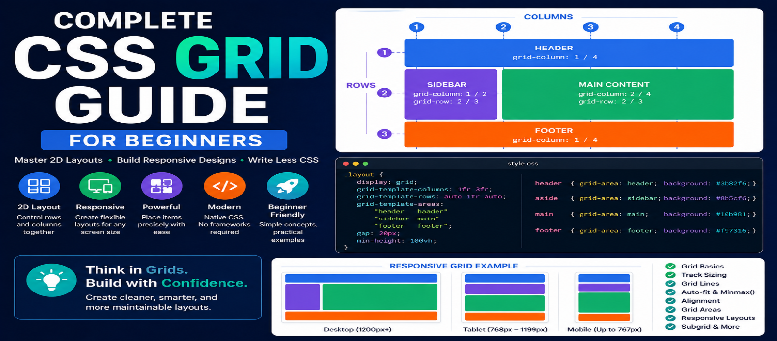
"Learn CSS Grid from scratch with practical examples covering rows, columns, fr units, gap, minmax(), auto-fit, responsive layouts, grid areas, subgrid, and Grid vs Flexbox."
Complete CSS Grid Guide for Beginners in 2026
Modern websites need layouts that work across phones, tablets, laptops, and large desktop screens. CSS Grid gives developers a powerful native layout system for arranging content into rows and columns without relying on complicated positioning tricks.
Whether you're creating a dashboard, gallery, blog layout, pricing section, or responsive card collection, Grid can turn what looks like a complicated layout problem into relatively simple CSS.
This beginner-friendly guide explains CSS Grid from the fundamentals to practical responsive layouts you can start using immediately.
What Is CSS Grid?
CSS Grid is a two-dimensional CSS layout system.
That means it can control:
Rows ↕ + Columns ↔
at the same time.
Suppose you have six cards:
<div class="grid">
  <div>HTML</div>
  <div>CSS</div>
  <div>JavaScript</div>
  <div>React</div>
  <div>Node.js</div>
  <div>Git</div>
</div>
Turn their parent into a grid container:
.grid {
  display: grid;
}
The direct children become grid items.
From there, you can define exactly how those items should be arranged.
Your First CSS Grid Layout
Let's create three equal columns:
.grid {
  display: grid;
  grid-template-columns: 1fr 1fr 1fr;
  gap: 20px;
}
The result is:
┌────────┬────────┬────────┐
│ Item 1 │ Item 2 │ Item 3 │
├────────┼────────┼────────┤
│ Item 4 │ Item 5 │ Item 6 │
└────────┴────────┴────────┘
The fr unit represents a fraction of the available space.
Because all three columns use 1fr, they receive equal shares.
Use repeat() to Write Cleaner Grid CSS
Instead of:
grid-template-columns: 1fr 1fr 1fr;you can write:
grid-template-columns: repeat(3, 1fr);This becomes particularly useful when creating larger grids.
For example:
grid-template-columns: repeat(4, 1fr);creates four equal columns.
Understanding Rows
Columns aren't the only dimension Grid controls.
You can explicitly define rows:
.grid {
  display: grid;
  grid-template-columns: repeat(3, 1fr);
  grid-template-rows: 150px 250px;
}
This creates two explicitly sized rows.
In many layouts, however, you don't need to specify every row. Grid can automatically create additional rows as content is added.
gap: Create Space Between Grid Items
Use gap to control spacing:
.grid {
  display: grid;
  gap: 24px;
}
Or control each direction independently:
.grid {
  row-gap: 20px;
  column-gap: 30px;
}
This is generally cleaner than manually adding margins to every grid item.
Build a Responsive Grid Without Many Media Queries
One of Grid's most useful patterns combines:
repeat() + auto-fit + minmax()
.cards {
  display: grid;
  grid-template-columns:
    repeat(auto-fit, minmax(250px, 1fr));
  gap: 1.5rem;
}
This tells the browser:
Create as many columns as will fit, keep each at least 250px wide, and let them expand to share remaining space.
A large screen might display:
Card | Card | Card | Card
A smaller screen could become:
Card | Card
and eventually:
Card
This allows the layout to respond naturally to available space.
What Does minmax() Do?
minmax() defines a minimum and maximum track size.
grid-template-columns:
  repeat(3, minmax(200px, 1fr));
Each column can be at least 200px wide while growing up to its proportional share of the available space.
It's especially useful for responsive card layouts.
Position Items With Grid Lines
Grid creates numbered lines around its rows and columns.
You can use them to control where an item appears:
.featured {
  grid-column: 1 / 3;
}
This item starts at column line 1 and ends at line 3, so it spans two columns.
A useful shorthand is:
.featured {
  grid-column: span 2;
}
Similarly:
.tall-card {
  grid-row: span 2;
}
allows an item to span two rows.
Build a Page Layout With Grid
Grid works well for larger page structures.
.page {
  display: grid;
  grid-template-columns: 240px 1fr;
  gap: 2rem;
}
This creates:
┌──────────┬─────────────────────┐
│ Sidebar  │                     │
│          │    Main Content     │
│          │                     │
└──────────┴─────────────────────┘
The sidebar receives 240px, while the main content uses the remaining space.
For smaller screens, you could switch to:
@media (max-width: 700px) {
  .page {
    grid-template-columns: 1fr;
  }
}
Now the sections stack vertically.
Grid Template Areas
Named grid areas can make complex layouts easier to understand.
.layout {
  display: grid;

  grid-template-areas:
    "header header"
    "sidebar main"
    "footer footer";

  grid-template-columns: 220px 1fr;
}
Assign each section:
header  { grid-area: header; }
aside   { grid-area: sidebar; }
main    { grid-area: main; }
footer  { grid-area: footer; }
The layout becomes visually understandable directly from the CSS:
HEADER   HEADER
SIDEBAR  MAIN
FOOTER   FOOTER
This can be particularly useful for page-level layouts.
Aligning Items Inside a Grid
Grid includes powerful alignment controls.
justify-items
Controls alignment along the inline axis:
.grid {
  justify-items: center;
}
align-items
Controls alignment along the block axis:
.grid {
  align-items: center;
}
To center items in both directions:
.grid {
  place-items: center;
}
place-items is a convenient shorthand for alignment.
Align the Entire Grid
There is an important distinction between aligning items inside tracks and aligning the grid itself inside its container.
Properties such as:
justify-content
align-content
place-content
control how the grid tracks are positioned when the grid container has extra available space.
Understanding this difference helps when alignment appears not to behave as expected.
Explicit vs Implicit Grid
Suppose you define:
grid-template-columns: repeat(3, 1fr);but add ten items.
You defined the columns, but Grid automatically creates the additional rows required to contain the remaining items.
These automatically generated tracks form the implicit grid.
You can control automatically created rows with:
grid-auto-rows: 150px;or:
grid-auto-rows: minmax(100px, auto);This is useful when content is generated dynamically.
What Is CSS Subgrid?
Sometimes nested components need to align with tracks defined by their parent grid.
subgrid allows a nested grid to reuse track definitions from its parent.
Conceptually:
.card {
  display: grid;
  grid-template-rows: subgrid;
}
This can be useful when multiple cards contain:
Title → Description → Price → Button
but their content lengths differ.
Instead of forcing fixed heights, subgrid can help related content align consistently.
It's a more advanced feature, so beginners should first become comfortable with standard Grid.
CSS Grid vs Flexbox
This is one of the most common beginner questions.
Choose Grid when:
- You need rows and columns
- Building dashboards
- Creating galleries
- Designing page layouts
- Arranging card collections
- Items need two-dimensional alignment
Choose Flexbox when:
- Items mainly flow in one direction
- Building navigation bars
- Aligning buttons
- Creating toolbars
- Centering elements
- Distributing items along a row or column
Think:
Flexbox = One-Dimensional
Grid = Two-Dimensional
But you don't have to choose only one.
A Grid page can contain Flexbox navigation, while each Grid card can use Flexbox internally.
Practical Responsive Card Example
Here's a pattern worth remembering:
.cards {
  display: grid;
  grid-template-columns:
    repeat(auto-fit, minmax(240px, 1fr));
  gap: 1.25rem;
}

.card {
  padding: 1.5rem;
  border: 1px solid #ddd;
  border-radius: 12px;
}
With just a few lines, you get a flexible card collection that adapts to different widths.
This is one of the easiest ways to understand why Grid is so useful.
Common CSS Grid Mistakes
Using Grid for Everything
Not every layout requires two dimensions. Flexbox may be simpler for navigation or button groups.
Setting Too Many Fixed Widths
Grid becomes much more flexible when using units such as:
fr → % → minmax() → auto
rather than hard-coding every track.
Forgetting gap
Don't create complicated margin rules when gap solves the spacing problem directly.
Confusing Items and Tracks
Grid properties can affect either the container, tracks, or individual items. Check where a property belongs before assuming Grid isn't working.
Ignoring Overflow
A grid can still overflow if its content cannot shrink appropriately. Test with long text, images, and small screens.
CSS Grid Cheat Sheet
For a simple equal-column layout:
.grid {
  display: grid;
  grid-template-columns: repeat(3, 1fr);
  gap: 1rem;
}
For a responsive layout:
.grid {
  display: grid;
  grid-template-columns:
    repeat(auto-fit, minmax(250px, 1fr));
  gap: 1rem;
}
For centered items:
.grid {
  display: grid;
  place-items: center;
}
These three patterns cover a surprising number of everyday layouts.
Best Way to Learn CSS Grid
Build layouts instead of memorizing properties.
Try creating:
1. Three-Column Layout
↓
2. Responsive Card Gallery
↓
3. Sidebar + Content Layout
↓
4. Dashboard
↓
5. Full Page With Header, Sidebar, Main and Footer
Resize the browser after every change.
You'll quickly develop an understanding of how Grid distributes available space.
Conclusion
CSS Grid gives developers a clean, native way to create responsive rows-and-columns layouts.
Start by mastering:
display: grid → grid-template-columns → fr → gap → repeat() → minmax() → auto-fit → Grid Lines
Then move into template areas, alignment, implicit grids, and subgrid.
You don't need to memorize every property.
Once you understand tracks, grid items, available space, and responsive sizing, CSS Grid becomes much easier to use.
Get a Free Access To 200+ Free Tools:
|
Home |
https://webtoolscorner.com/ |
|
Calculators Tools |
https://webtoolscorner.com/category/calculators |
|
Text & Convertor Tools |
https://webtoolscorner.com/category/text-tools |
|
PDF & Image Tools |
https://webtoolscorner.com/category/pdf-tools |
|
Games & Developer Tools |
https://webtoolscorner.com/category/games-and-developer-tools |
|
Resume Builder |
https://webtoolscorner.com/resume |