
Modern CSS Explained: Everything Developers Need to Know in 2026
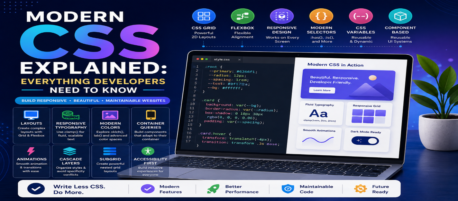
"Learn modern CSS in 2026 with practical examples of Grid, Flexbox, container queries, CSS variables, :has(), nesting, clamp(), subgrid, responsive design, animations, and more."
Modern CSS Explained: Everything Developers Need to Know in 2026
CSS has evolved far beyond changing colors, fonts, and margins. Modern CSS can handle responsive layouts, reusable design systems, component-level responsiveness, advanced selectors, animations, custom properties, mathematical calculations, and sophisticated visual effects—often without relying on JavaScript.
For developers in 2026, understanding modern CSS isn't about memorizing every property. It's about knowing which native browser features can solve common design problems cleanly and efficiently.
This guide covers the modern CSS concepts that matter most when building responsive, maintainable websites.
What Is CSS?
CSS stands for Cascading Style Sheets. It controls how HTML content is presented.
A simple example:
.card {
  padding: 1.5rem;
  border-radius: 12px;
  background: white;
}
A useful way to think about front-end development is:
HTML → Structure and Meaning
CSS → Layout and Presentation
JavaScript → Behavior and Interactivity
Modern CSS significantly expands what can be achieved within the presentation layer itself.
1. CSS Grid for Two-Dimensional Layouts
CSS Grid is particularly useful when you need control over both rows and columns.
For example:
.dashboard {
  display: grid;
  grid-template-columns: 250px 1fr;
  gap: 2rem;
}
This creates a fixed-width sidebar and a flexible content area.
For responsive card layouts, you can use:
.cards {
  display: grid;
  grid-template-columns:
    repeat(auto-fit, minmax(250px, 1fr));
  gap: 1rem;
}
The browser automatically adjusts how many columns fit within the available space.
Grid is excellent for:
- Dashboards
- Galleries
- Card collections
- Page layouts
- Complex content sections
2. Flexbox for One-Dimensional Layouts
Flexbox remains one of the most useful CSS layout tools.
It works particularly well when arranging elements primarily along one axis.
.navigation {
  display: flex;
  align-items: center;
  justify-content: space-between;
  gap: 1rem;
}
Common uses include:
Navigation Bars → Button Groups → Form Controls → Toolbars → Centering → Card Content
A simple rule of thumb:
Grid → Rows + Columns
Flexbox → Row or Column
They aren't competitors. Professional layouts frequently use both.
3. Container Queries
Traditional responsive design often depends on viewport-based media queries.
For example:
@media (max-width: 768px) {
  .card {
    padding: 1rem;
  }
}
But reusable components don't always know how much space they'll receive.
Container queries allow a component to respond to the size of its container instead.
.wrapper {
  container-type: inline-size;
}

@container (min-width: 500px) {
  .card {
    display: grid;
    grid-template-columns: 1fr 2fr;
  }
}
Now the card adapts based on where it is placed, rather than only the overall screen width.
This is especially useful for component-based design systems.
4. CSS Custom Properties
CSS custom properties—often called CSS variables—make reusable values easier to manage.
:root {
  --primary: #2563eb;
  --spacing: 1rem;
  --radius: 10px;
}
Use them anywhere:
.button {
  background: var(--primary);
  padding: var(--spacing);
  border-radius: var(--radius);
}
Change the variable once and every element using it can update automatically.
Custom properties are useful for:
- Themes
- Colors
- Spacing systems
- Typography
- Component configuration
- Dark mode
Unlike preprocessor variables, CSS custom properties participate in the cascade and can change dynamically.
5. The :has() Selector
The :has() relational pseudo-class enables styles based on an element's relationships.
For example:
.card:has(img) {
  padding-top: 0;
}
Or:
form:has(input:invalid) {
  border-color: red;
}
This allows CSS to respond to what an element contains or relates to, reducing the need for extra classes or JavaScript in some interface patterns.
Use it purposefully rather than creating unnecessarily complicated selectors.
6. CSS Nesting
Modern CSS supports nesting, allowing related selectors to be grouped more naturally.
Instead of:
.card {
  padding: 1rem;
}

.card h2 {
  margin: 0;
}

.card:hover {
  transform: translateY(-2px);
}
you can organize related rules:
.card {
  padding: 1rem;

  h2 {
    margin: 0;
  }

  &:hover {
    transform: translateY(-2px);
  }
}
Nesting can improve readability, but excessive nesting can still make styles difficult to understand.
Keep selectors simple.
7. Responsive Typography With clamp()
Responsive typography once required multiple media queries.
Modern CSS can make it fluid:
h1 {
  font-size: clamp(2rem, 5vw, 4.5rem);
}
clamp() accepts:
Minimum → Preferred → Maximum
The heading grows with the viewport but never becomes smaller than 2rem or larger than 4.5rem.
The same technique can be useful for:
- Spacing
- Widths
- Gaps
- Padding
- Component dimensions
8. Modern CSS Color
Modern CSS supports increasingly sophisticated ways to work with color.
Developers may encounter functions and color spaces such as:
rgb()
hsl()
hwb()
lab()
lch()
oklab()
oklch()
For example:
.button {
  background: oklch(60% 0.18 250);
}
Modern color capabilities can provide greater control when building consistent palettes and design systems.
Browser support should still be considered when adopting newer features.
9. Logical Properties
Traditional CSS often uses:
margin-left
padding-right
border-top
Logical properties describe layout relative to writing direction.
Examples include:
margin-inline
padding-block
border-inline-start
For example:
.article {
  padding-inline: 2rem;
  margin-block: 1rem;
}
These properties are particularly valuable for websites supporting languages with different writing directions.
10. Aspect Ratio
Maintaining proportions once required CSS tricks.
Now:
.video {
  aspect-ratio: 16 / 9;
}
or:
.avatar {
  aspect-ratio: 1;
}
This is useful for:
Videos → Images → Cards → Thumbnails → Media Containers
It makes responsive layouts considerably easier to maintain.
11. CSS Subgrid
Suppose several cards contain:
Title → Description → Button
Different text lengths can cause their internal elements to become misaligned.
Subgrid allows nested grid elements to participate in the track sizing of a parent grid.
Conceptually:
.card {
  display: grid;
  grid-template-rows: subgrid;
}
This is useful for maintaining alignment across repeated components without manually forcing fixed heights.
12. Cascade Layers
Large websites often contain styles from different sources:
Reset → Framework → Components → Utilities → Overrides
Cascade layers help control which groups of styles take precedence.
@layer reset, base, components, utilities;You can then define:
@layer components {
  .button {
    padding: 0.75rem 1rem;
  }
}
This can reduce specificity battles and excessive use of !important.
13. Native CSS Animations and Transitions
CSS can handle many interface animations without JavaScript.
A basic transition:
.button {
  transform: scale(1);
  transition: transform 200ms ease;
}

.button:hover {
  transform: scale(1.05);
}
CSS also supports keyframe animations for more complex effects.
However, animation should improve the interface rather than distract from it.
Respect users who prefer reduced motion:
@media (prefers-reduced-motion: reduce) {
  * {
    animation: none;
    transition: none;
  }
}
Accessibility should be part of animation design.
14. Dark Mode With User Preferences
CSS can detect a user's preferred color scheme:
@media (prefers-color-scheme: dark) {
  :root {
    --background: #111;
    --text: #fff;
  }
}
Combined with CSS custom properties, this makes theme management much easier.
Many applications also provide a manual theme switch so users aren't restricted to their operating-system preference.
15. Modern CSS Can Reduce JavaScript
Before adding JavaScript to solve a visual problem, ask:
Can modern HTML or CSS already handle this?
Features such as:
Grid + Flexbox + :has() + Container Queries + Native Dialogs + Details/Summary + CSS Animations
can eliminate unnecessary JavaScript from some interfaces.
That doesn't mean JavaScript is bad.
Use JavaScript for behavior that genuinely requires programming logic rather than recreating capabilities already provided by the platform.
A Practical Modern CSS Strategy
For a new project, consider this workflow:
1. Create semantic HTML
↓
2. Define design variables
↓
3. Build layouts with Grid/Flexbox
↓
4. Add responsive behavior
↓
5. Create reusable components
↓
6. Add interaction and animation carefully
↓
7. Test accessibility and browser support
This produces cleaner CSS than adding random fixes whenever something breaks.
Common CSS Mistakes
Avoid:
- Excessive
!important - Deeply nested selectors
- Unnecessary fixed dimensions
- Too many arbitrary breakpoints
- Recreating Grid layouts with positioning
- Ignoring keyboard/focus states
- Animating everything
- Adding JavaScript for simple CSS problems
- Using new features without considering browser support
Modern CSS is powerful, but maintainability still matters.
Conclusion
CSS in 2026 is a sophisticated layout and design system rather than merely a collection of styling properties.
Features such as Grid, Flexbox, container queries, custom properties, :has(), nesting, clamp(), logical properties, subgrid, cascade layers, modern colors, and responsive design tools allow developers to build interfaces that previously required significantly more code.
You don't need to use every new CSS feature.
Instead, learn which modern capabilities solve real development problems and gradually incorporate them into your projects.
The best modern CSS isn't the CSS with the most advanced features.
It's the CSS that makes your website responsive, accessible, maintainable, and easier to develop.