
Modern CSS Features Every Web Developer Should Know in 2026
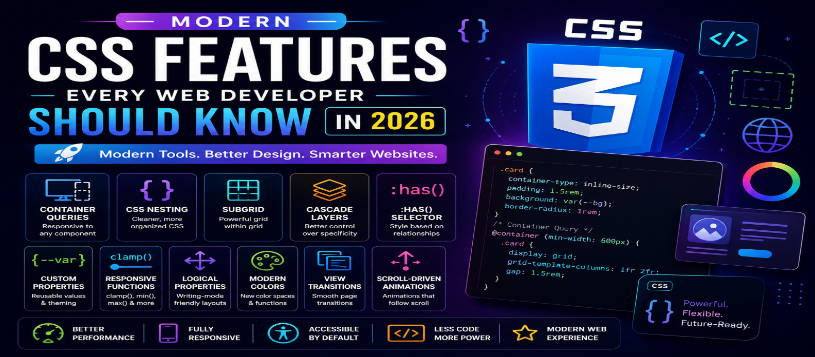
"Discover the modern CSS features every web developer should know in 2026, including container queries, CSS nesting, subgrid, cascade layers, (), custom properties, responsive functions, view transitions, and more."
Modern CSS Features Every Web Developer Should Know in 2026
CSS has evolved far beyond basic colors, fonts, margins, and layouts. In 2026, modern CSS gives developers powerful tools for building responsive, interactive, accessible, and maintainable websites with less JavaScript and fewer external dependencies.
Features such as container queries, CSS nesting, subgrid, cascade layers, custom properties, modern color functions, logical properties, and view transitions are changing how developers approach frontend design.
This guide explores the modern CSS features every web developer should know in 2026 and explains where they can be useful.
1. Container Queries
Traditional responsive design relies heavily on viewport-based media queries. Container queries allow components to respond to the size of their containing element instead.
This is especially useful for reusable components that may appear in different areas of a website.
.card-container {
  container-type: inline-size;
}

@container (min-width: 500px) {
  .card {
    display: flex;
  }
}
A card can therefore adapt based on the available space rather than the entire browser window.
2. CSS Nesting
CSS nesting allows developers to organize related styles inside a parent selector.
.navigation {
  display: flex;

  a {
    text-decoration: none;

    &:hover {
      text-decoration: underline;
    }
  }
}
This can make stylesheets easier to read and maintain while reducing the need for preprocessing solely to obtain nesting syntax.
3. CSS Grid
CSS Grid remains one of the most powerful tools for creating two-dimensional layouts.
.layout {
  display: grid;
  grid-template-columns: repeat(3, 1fr);
  gap: 1rem;
}
Grid is particularly useful for dashboards, galleries, product listings, landing pages, and complex website layouts.
4. CSS Subgrid
Subgrid allows a nested grid to use the track sizing of its parent grid.
.card {
  display: grid;
  grid-template-rows: subgrid;
}
This helps align content across multiple components without manually duplicating grid definitions.
It is especially useful when cards contain different amounts of text but still need consistent alignment.
5. Cascade Layers
Cascade layers give developers greater control over how groups of CSS rules interact.
@layer reset, base, components, utilities;They can help organize styles into predictable layers such as:
Reset → Base → Components → Utilities
This can reduce specificity conflicts in large projects and design systems.
6. CSS Custom Properties
CSS variables, officially known as custom properties, make reusable design values easier to manage.
:root {
  --primary-color: #2563eb;
  --spacing: 1rem;
}

.button {
  background: var(--primary-color);
  padding: var(--spacing);
}
Custom properties are excellent for themes, spacing systems, component libraries, and dark mode.
7. The :has() Selector
The :has() relational pseudo-class allows developers to style an element based on what it contains or its related elements.
.card:has(img) {
  padding-top: 0;
}
It enables styling patterns that previously required additional classes or JavaScript.
For example, developers can change the appearance of a form, card, navigation item, or container depending on its contents.
8. Modern Responsive Functions
Functions such as clamp(), min(), and max() make responsive sizing more flexible.
h1 {
  font-size: clamp(2rem, 5vw, 4rem);
}
This allows text or spacing to scale fluidly while remaining within defined minimum and maximum values.
It can reduce the number of media queries needed for responsive designs.
9. Logical Properties
Logical properties make layouts more adaptable to different writing directions.
Instead of:
margin-left: 20px;developers can use:
margin-inline-start: 20px;Other useful logical properties include:
padding-inlinemargin-blockinset-inlineborder-block
These properties are particularly valuable for multilingual websites.
10. Modern CSS Color Functions
CSS now provides more flexible ways to work with color.
Developers can use modern color spaces and functions to create richer design systems, manipulate colors, and produce more consistent visual experiences.
A modern design system can use CSS to manage:
- Theme colors
- Light and dark variations
- Transparency
- Color mixing
- Wider-gamut colors
However, developers should still test accessibility and ensure sufficient contrast.
11. CSS Aspect Ratio
The aspect-ratio property makes it easy to maintain consistent proportions.
.video {
  aspect-ratio: 16 / 9;
}
This is useful for:
- Videos
- Images
- Cards
- Embedded content
- Responsive media
It reduces the need for older padding-based aspect-ratio techniques.
12. Native CSS Nesting With Media Queries
Modern CSS allows developers to combine responsive rules with more organized component styling.
This can make component-level responsive design easier to maintain and reduce repetitive selectors.
The result is cleaner stylesheets and more modular frontend architecture.
13. View Transitions
View transitions can create smoother visual transitions between different interface states and, where supported and appropriate, page navigations.
They can be useful for:
- Page transitions
- Image galleries
- Navigation
- Dynamic interfaces
- Single-page applications
Developers should use animation carefully and respect users who prefer reduced motion.
14. Scroll-Driven Animations
Modern CSS is gaining increasingly powerful capabilities for connecting animations to scrolling.
These effects can be useful for:
- Progress indicators
- Content reveals
- Interactive storytelling
- Visual transitions
However, excessive scroll animation can hurt usability and performance, so it should enhance the experience rather than distract from content.
15. Native CSS Popover and Anchor-Related Styling
Modern web interfaces increasingly rely on native browser capabilities for elements such as popovers, menus, tooltips, and positioned UI components.
CSS can work with these capabilities to create sophisticated interfaces with less custom JavaScript.
This can make components simpler, more maintainable, and potentially more accessible when implemented correctly.
Why Modern CSS Matters in 2026
Modern CSS allows developers to solve problems that once required:
- JavaScript
- CSS preprocessors
- Large utility libraries
- Complicated workarounds
That does not mean frameworks or JavaScript are unnecessary. Instead, developers can choose native CSS whenever the browser already provides a suitable solution.
This can result in cleaner code, fewer dependencies, better maintainability, and potentially improved performance.
Modern CSS Best Practices
When using newer CSS features:
- Check browser compatibility.
- Provide fallbacks when necessary.
- Use semantic HTML alongside CSS.
- Keep accessibility in mind.
- Avoid unnecessary animations.
- Organize styles consistently.
- Test across screen sizes.
- Measure performance instead of assuming it.
Newer does not automatically mean better. Use each feature when it solves a genuine design or development problem.
Conclusion
Modern CSS in 2026 is more powerful than ever. Developers can create advanced responsive layouts, reusable components, sophisticated design systems, and interactive experiences directly in the browser.
Features such as container queries, nesting, subgrid, cascade layers, :has(), custom properties, logical properties, responsive functions, modern colors, view transitions, and scroll-driven animations can significantly improve frontend development.
The best approach is not to use every new feature immediately. Learn what each feature solves, check browser support, and gradually incorporate the most useful capabilities into real projects.
Mastering modern CSS can help web developers build websites that are cleaner, faster, more responsive, accessible, and easier to maintain in 2026 and beyond.
Get a Free Access To 200+ Free Tools:
|
Home Page |
|
|
Calculator Tools |
|
|
Text & Converter Tools |
|
|
PDF & Image Tools |
|
|
Games & Developer Tools |
|
|
Resume Builder |